AngelicaPT Website
AngelicaPT Website
I refined the existing brand guidelines, integrating color and design elements around their existing logo. I also led the website's development from initial wireframes through to the final visual design.
Client
AngelicaPT
Year
2024
Category
UI / UX Design

Research
Research
For the research phase of the AngelicaPT project, I focused on exploring the websites of other local personal trainers. My goal was to fully understand the competitive landscape and identify design elements and user experiences that would allow AngelicaPT's site to truly stand out in the market and address common user frustrations found elsewhere.
For the research phase of the AngelicaPT project, I focused on exploring the websites of other local personal trainers. My goal was to fully understand the competitive landscape and identify design elements and user experiences that would allow AngelicaPT's site to truly stand out in the market and address common user frustrations found elsewhere.
Research
For the research phase of the AngelicaPT project, I focused on exploring the websites of other local personal trainers. My goal was to fully understand the competitive landscape and identify design elements and user experiences that would allow AngelicaPT's site to truly stand out in the market and address common user frustrations found elsewhere.

DESIGN & DEVELOPMENT
DESIGN & DEVELOPMENT
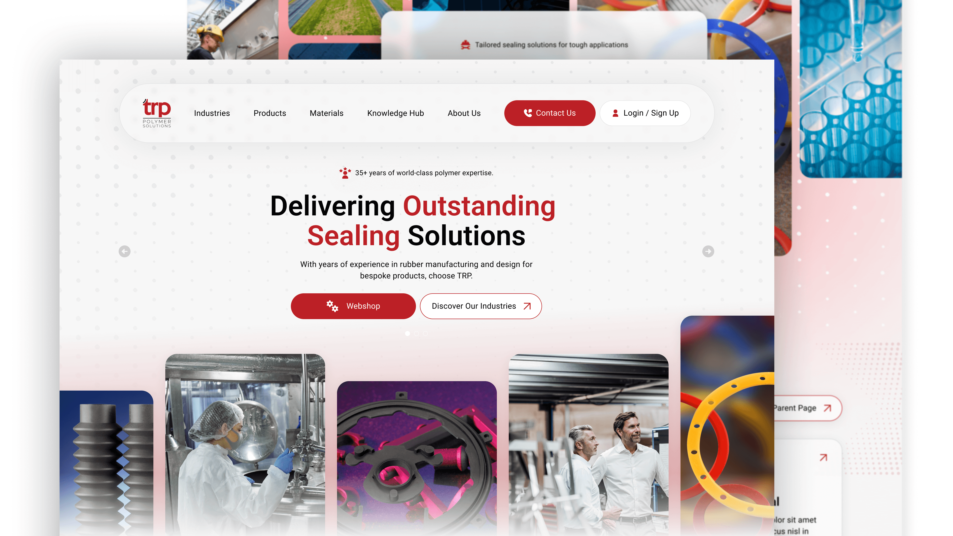
I wanted the site to feel fast and energetic, just like a workout. I used a high-contrast blue and black palette combined with bold imagery to create a strong visual impact immediately. Behind the scenes, I focused on a simple, single-page architecture that guides people naturally from learning about the services to booking their first consultation.
I wanted the site to feel fast and energetic, just like a workout. I used a high-contrast blue and black palette combined with bold imagery to create a strong visual impact immediately. Behind the scenes, I focused on a simple, single-page architecture that guides people naturally from learning about the services to booking their first consultation.
DESIGN & DEVELOPMENT
I wanted the site to feel fast and energetic, just like a workout. I used a high-contrast blue and black palette combined with bold imagery to create a strong visual impact immediately. Behind the scenes, I focused on a simple, single-page architecture that guides people naturally from learning about the services to booking their first consultation.

OUTCOME
OUTCOME
The result is a punchy, modern site that gives AngelicaPT a much stronger professional edge. By stripping away the fluff and focusing on a clear user journey, I’ve made it incredibly easy for new clients to see results and get in touch. It’s a clean, high-performance digital space that perfectly reflects the quality of the training itself.
The result is a punchy, modern site that gives AngelicaPT a much stronger professional edge. By stripping away the fluff and focusing on a clear user journey, I’ve made it incredibly easy for new clients to see results and get in touch. It’s a clean, high-performance digital space that perfectly reflects the quality of the training itself.
OUTCOME
The result is a punchy, modern site that gives AngelicaPT a much stronger professional edge. By stripping away the fluff and focusing on a clear user journey, I’ve made it incredibly easy for new clients to see results and get in touch. It’s a clean, high-performance digital space that perfectly reflects the quality of the training itself.
More Works More Works
More Works More Works