ProRTX
ProRTX
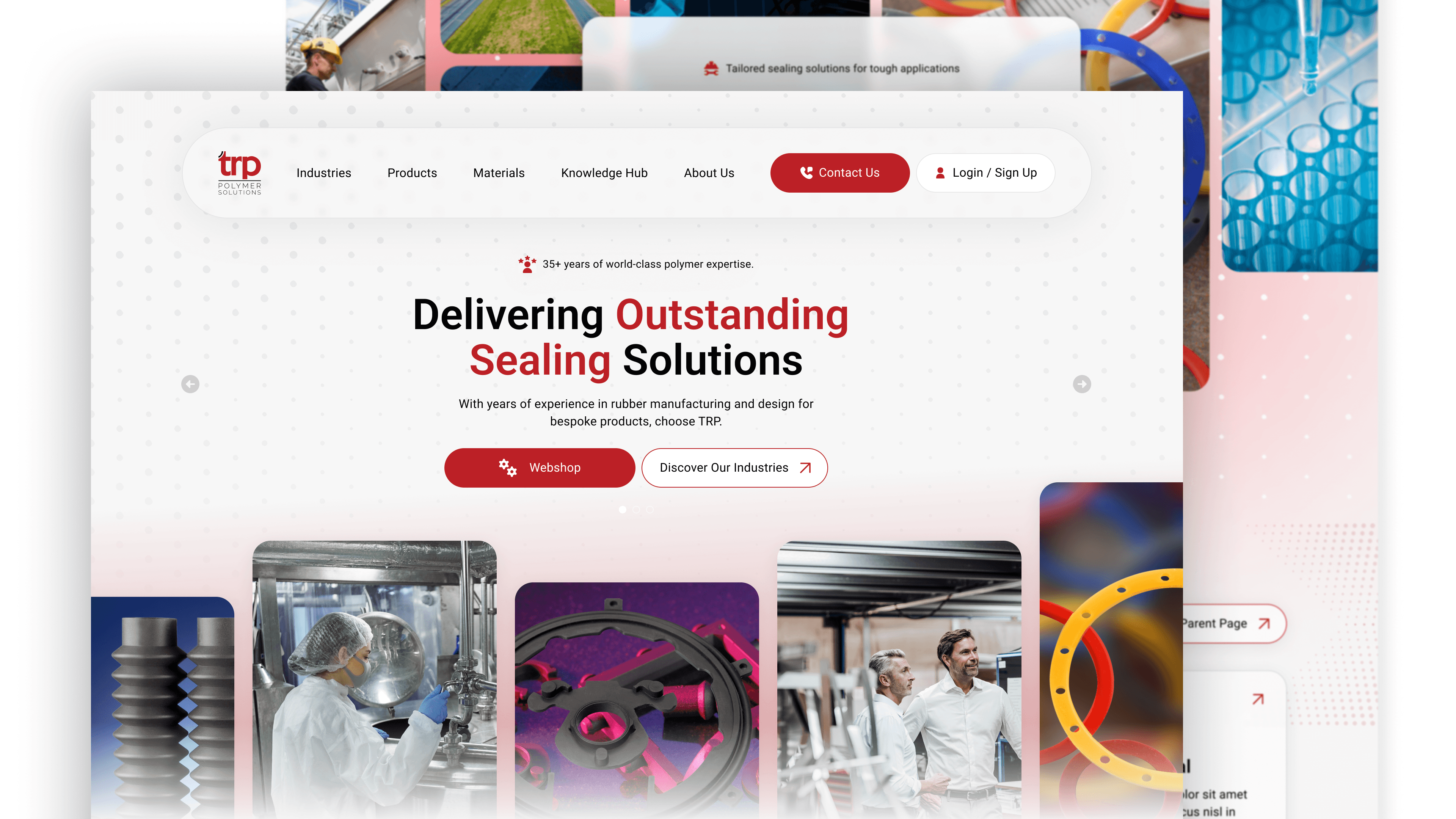
ProRTX provides durable, high-quality workwear across the UK’s industrial and corporate sectors. I redesigned their digital platform to simplify a vast product catalogue, creating a streamlined B2B journey that balances rugged brand values with modern, intuitive navigation.
Client
ProRTX
Year
2025
Category
UI / UX DesignDesign

Research
Research
I explored Pro RTX’s product range, target audience, and competitors to understand what sets them apart – quality, variety, and value. I looked at similar UK workwear brands to identify visual trends, helping shape a design that balances style with practicality.
I explored Pro RTX’s product range, target audience, and competitors to understand what sets them apart – quality, variety, and value. I looked at similar UK workwear brands to identify visual trends, helping shape a design that balances style with practicality.
Research
I explored Pro RTX’s product range, target audience, and competitors to understand what sets them apart – quality, variety, and value. I looked at similar UK workwear brands to identify visual trends, helping shape a design that balances style with practicality.

DESIGN & DEVELOPMENT
DESIGN & DEVELOPMENT
The goal was to simplify a large B2B product catalogue into a high-performance digital experience. I focused on intuitive navigation to help professional buyers move from discovery to enquiry with zero friction.
Tactile Visual Trust: I prioritised high-resolution 'detail-zoom' imagery, allowing users to inspect fabric quality and stitching, which is essential for workwear procurement.
B2B Conversion Flow: I flattened the site hierarchy to focus on a "bulk-build" journey, guiding users seamlessly from technical specs to the contact phase.
DESIGN & DEVELOPMENT
The goal was to simplify a large B2B product catalogue into a high-performance digital experience. I focused on intuitive navigation to help professional buyers move from discovery to enquiry with zero friction.
Tactile Visual Trust: I prioritised high-resolution 'detail-zoom' imagery, allowing users to inspect fabric quality and stitching, which is essential for workwear procurement.
B2B Conversion Flow: I flattened the site hierarchy to focus on a "bulk-build" journey, guiding users seamlessly from technical specs to the contact phase.

OUTCOME
OUTCOME
I created a clean, modern layout that highlights the range’s durability and flexibility. The design focuses on inclusivity, showcasing garments across sizes, colours, and roles from office to industrial. Making it easy for users to visualise building a complete uniform.
I created a clean, modern layout that highlights the range’s durability and flexibility. The design focuses on inclusivity, showcasing garments across sizes, colours, and roles from office to industrial. Making it easy for users to visualise building a complete uniform.
OUTCOME
I created a clean, modern layout that highlights the range’s durability and flexibility. The design focuses on inclusivity, showcasing garments across sizes, colours, and roles from office to industrial. Making it easy for users to visualise building a complete uniform.
More Works More Works
More Works More Works